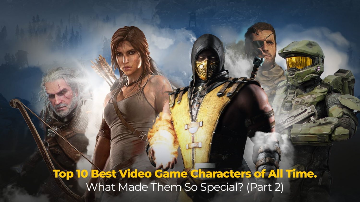
In part 1 of our blog, we took a trip down memory lane and reviewed some of the best video game characters (10-5).
So, Dream Farm Studios’ character design team and I geared up once again to analyze the other five’s characters and design to learn more about them and why gamers never stop talking about them.
| ⚠️ A little warning before you proceed. This blog contains spoilers, giving away details about the story or the fate of some characters. |
5. Geralt of Rivia
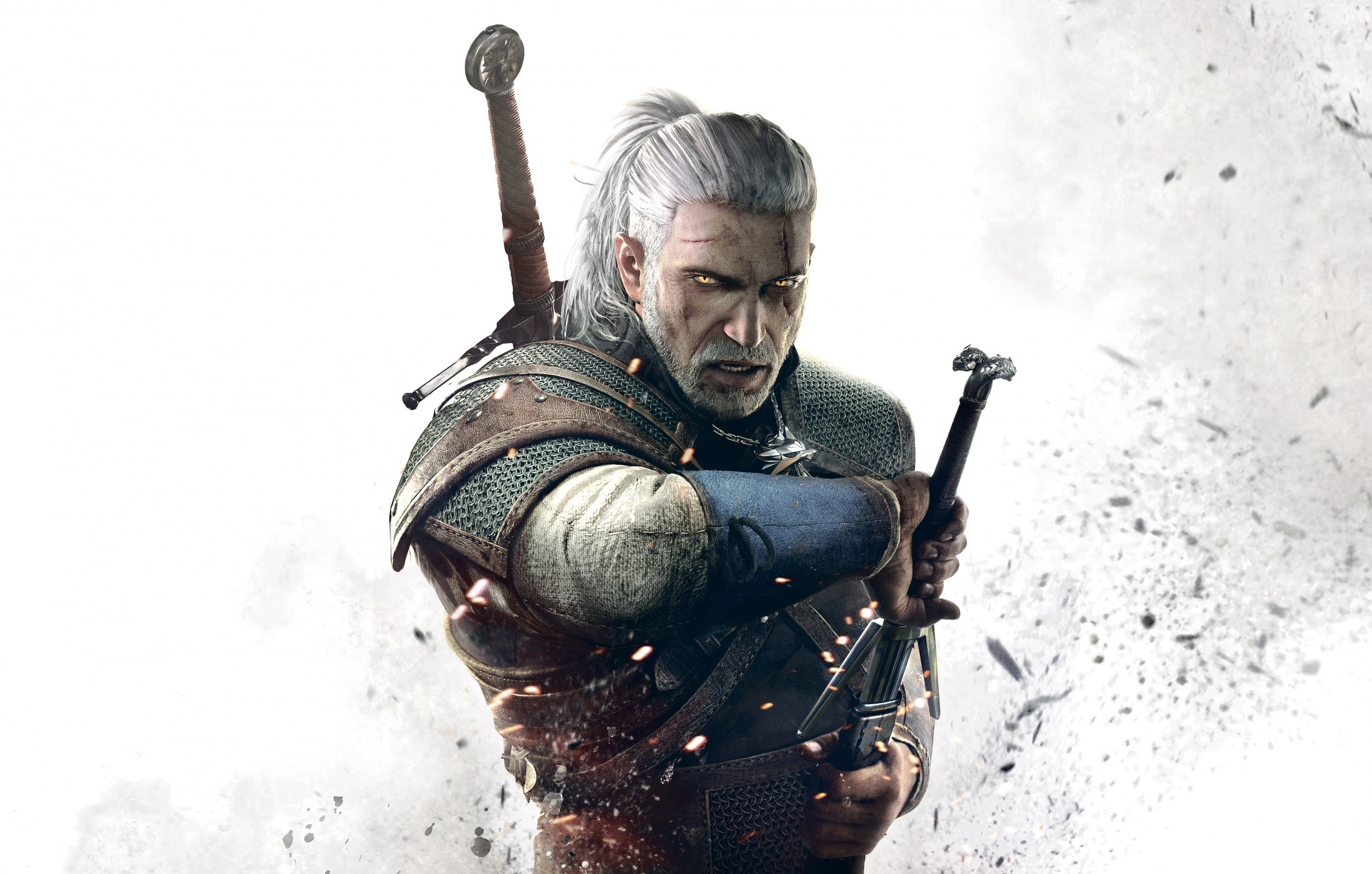
CD Projekt Red came busting through the door with The Witcher 3 in 2015. From the graphics to the music, story, and characters, everything was the nearest thing to perfection. But it was ‘the school of the wolf graduate’ who breathed heart and soul into the series. Ironically, Geralt of Rivia -just like any other Witcher -had been stripped away from any emotion in his childhood. Throughout the game, Geralt keeps a straight face in different situations and admits to others that he “can’t feel”. But Ciri, his adoptive daughter, changes all of that (seems like the reason is always a woman. Huh). The first father-daughter encounter brings out such joy in Geralt that even his cat eyes can conceal it. And if you unlock the worst ending, you’ll see just how emotional Geralt can get (don’t).
Geralt is constantly in romantic relationships with extremely attractive women, especially two: Yennefer of Vengenberg and Triss Merigold. The latter of the two, who is much younger, fights for a spot in Geralt’s heart. Although Geralt doesn’t decline Triss’ offers to become intimate with him, his love for Yennefer is obviously stronger, and he always chooses her over any other woman.
🔎Geralt of Rivia’s character design analysis
There are hundreds (literally) of armor and weapons you can craft or buy in the game. Still, our mutated warrior is introduced to us with a beautiful and iconic Kaer Morhen Armor. The game takes place in the 1200s (although in another world). This can be told by the gears and armor as they are made of leather, linen, and iron ore. His face is very masculine, mature, and threatening. But to make his relationship with beautiful women believable, he was ruggedly handsome in the Witcher 3. Thankfully, nearly all of Geralt’s armors and hairstyles in the game stay true to this, but the default Kaer Morhen style remains the best and most popular one.
As for Geralt’s hairstyle, it was most probably inspired by the samurais’ hair. So have his two swords, although Samurais don’t carry both swords on their backs. The ‘white wolf’ underwent suffering treatments to become a witcher and ended up with white hair, but at least he got a cool nickname out of it and ended up on many ‘top 10 video game characters’ lists. Right?
What makes Geralt so special?
We just love dads in video games. They aspire to right their wrongs and make sacrifices to create a better future for their children. In Geralt’s case, we see most of his fellow witchers free of emotions. Yet, the Rivia man breaks that barrier and shows demonstrates there’s more to him than a monster hunter.
4. Crash Bandicoot
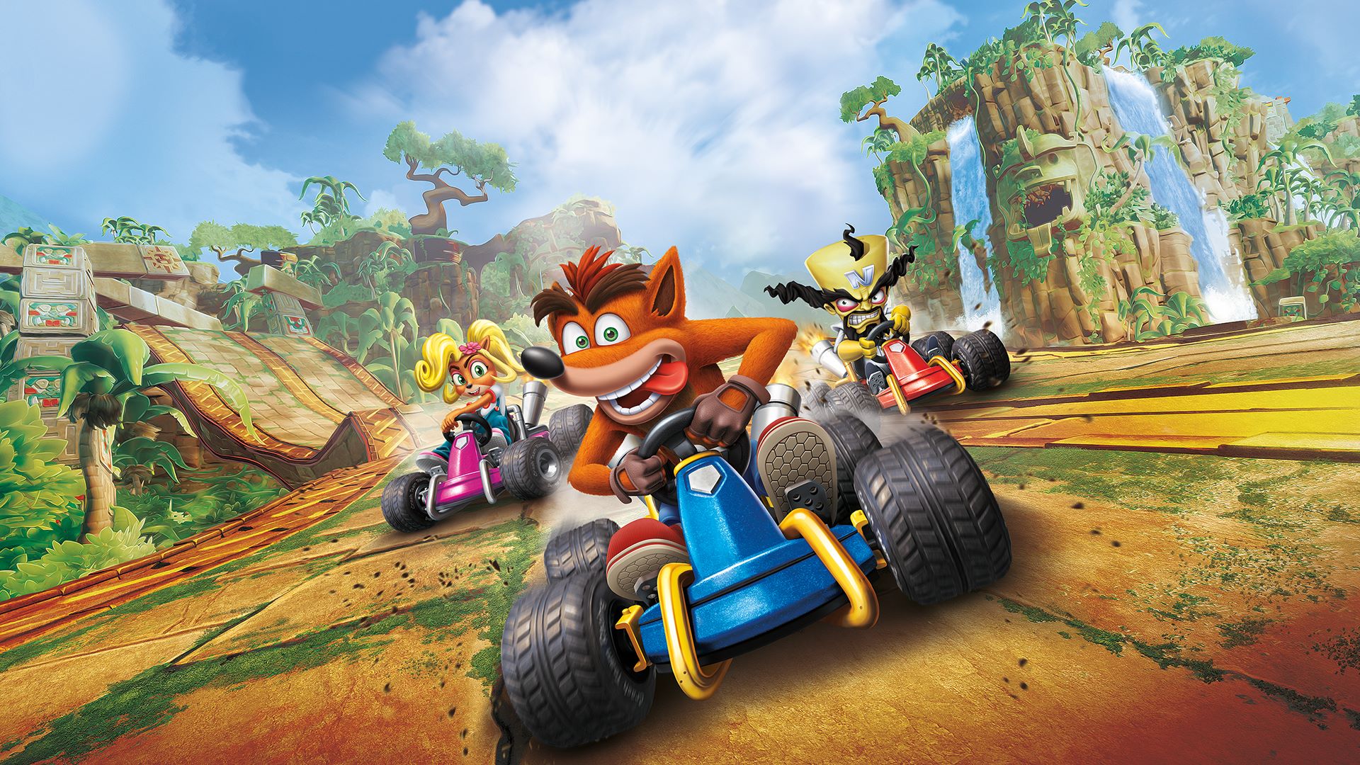
Crash made its debut 26 years ago as the Play Station mascot. The then-president of Sony hated the guts of our favorite character (believe it or not). But his impact was so immense on the console’s branding that they decided to keep him.

At first, I thought a character that can’t speak shouldn’t rank so high on such a list. But Crash’s lack of speech is deliberate. The game’s creators wanted a “cute” character and a “real” animal. They eventually chose the embodiment of a bandicoot because it was less known to people (rather than bears or mouses). The reason why he can’t speak is so that he can react innocently to incidents and what happens around him. I mean, look how easily he laughs and cries.
🔎Crash Bandicoot’s character design analysis
Often mistaken for a dog or a fox, this goofy video game character is my personal favorite because no matter how oblivious or playful, he always comes through to thwart Nortex’s sinister plots.
The exciting thing about the color of his skin is that Naughty Dog painted him orange to stand out from the environment and the background. Crash is on an island with heavy vegetation. Therefore making him gray or brown would’ve been a drastic mistake.
What makes Crash so special?
This goofball is one of the first characters (if not the first) that comes to our mind when we hear the word “Play Station One.” The red gloves, long ears, and spikey hair accentuate his daredevil personality, while his bravery, mixed with his dorkiness and innocence, make him a unique protagonist in our eyes.
3. Mario
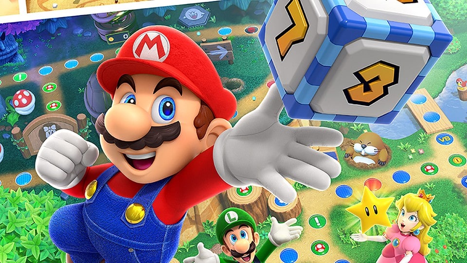
If you thought I was going to put anyone but Mario on my ‘top 10 video game characters’ list, then I’m sorry. This silent yet brave and straightforward Italian plumber is arguably the most famous video game character of all time. He is the first one that pops up in our minds whenever there’s a conversation about childhood games.
Nintendo producers have made Mario’s personality simple so he could fit in many different games and scenarios, something that makes his character underdeveloped in the eyes of many. But keeping his biography simple and adding traits in different situations only enabled the creators to use him in zillions of installments. Sure, he is always kind, playful, brave, and weapon-proficient, but players would have had fewer games to play with Mario as a lead character if it wasn’t for his versatility.
Mario is sometimes arrogant and uses Luigi as his stepping stone to shine. But his services and positive traits outweigh his flaws.
🔎Mario’s character design analysis
Let’s start with the colors. The use of red and blue in his character is absolutely genius. Using colors of contrast is always a winning card to keep your character in the eyes. We’re not sure if it would’ve made a big difference if Mario was a carpenter instead of a plumber (which he initially was), but judging by the pipes and underground missions in the game, it makes more sense for him to be in the latter profession.
“I was trying to use the technology available at the time to produce a distinctive-looking character from a small number of pixels, and that resulted in Mario. We wanted him to be someone who might live near you, and not a superhero.”
Shigeru Miyamoto, creator & designer of Mario
Then comes the mustache. Even the thought of it being absent is bothering, isn’t it? As for why this beloved character isn’t clean-shaven, we’ve got the design team to thank for. It was exceptionally difficult for them to create a small character with pixels without any special physical features (plus, Mario’s mouth initially looked somewhat like a mustache anyway). Therefore, the mustache was added.
What makes Mario so special?
Mario’s bravery is admirable as he always saves his damsel in distress and shows up when it’s time to save his beloved land. No questions asked. But more importantly, his simplicity lets us be him and experience thrilling adventures through his eyes and skin.
He’s our eternal alter ego.
2. Sonic the Hedgehog
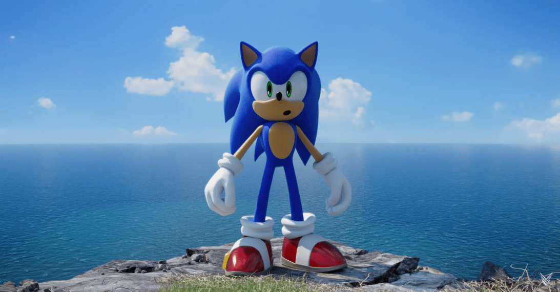
During the Nintendo-Sega battle, the latter’s president ordered the team to come up with a mascot for their brand, one that is as famous as Micky Mouse. And that’s what he got.
The creators took Sonic’s gloves from Micky and his shoes from Michael Jackson and came up with a character who is known globally as a celebrity.
Speaking of Mascots, you might be interested in creating one for your business or brand.
Sonic was set out to be a rabbit when the team first started with his creation, but the idea of a hedgehog who moves with ultra-light speed and can curve up into a concussive ball and attack enemies with its spikes would eventually prevail. Like Mario, the design is balanced. No unnecessary details or complexities. Just a simple character with an image that honors its identity.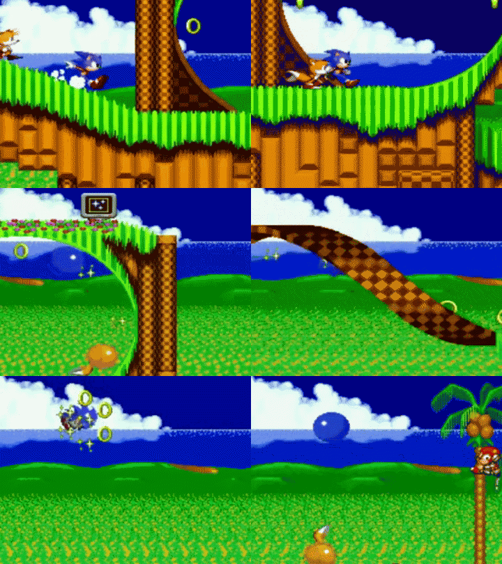
According to Yuji Naka, the game’s programmer, Sonic’s colors were meant to symbolize peace, trust, and coolness while also having to go with the Sega logo. The red color in his shoes explains his turbo speed.
Moreover, he has a “get it done” attitude and lives a pretty cool life. He loves to travel, run, read books, and taste new foods.
No wonder why every kid loves him. This brisk hedgehog has deservedly earned the “cool dude” nickname.
🔎Sonic the Hedgehog’s character design analysis
What can you think of other than a hedgehog that rolls around and does damage?
Of course, It wasn’t that easy for the creators in Sonic’s design stage. Like some other designers, they had to do a survey and go with the most likable character, which was a hedgehog out of an eggman and a dog, among other things.
The game design of the 80s was not very complex, and Sonic’s design as a character is no exception. The connected eyes and spikes, for example, were thought through, but the designers kept it simple for themselves as well as kids of that time who wished to draw him.
Another important thing to point out in Sonic is the exaggerated body parts (also seen in characters like Mario and Micky Mouse). Exaggeration gives life to characters, and each part of the body implies a specific meaning. In the blue hedgehog’s case, his hands and shoes are bigger, indicating he’s tactical and possesses the kind of speed that transcends friction, respectively.
What makes Sonic so special?
Sonic is always on the move, has a never-ending hunger for adventure, he’s brave, and doesn’t care about the enemies’ size or status. But what gives him a deeper character is his love for freedom and intolerance for injustice and oppression.
1. Scorpion
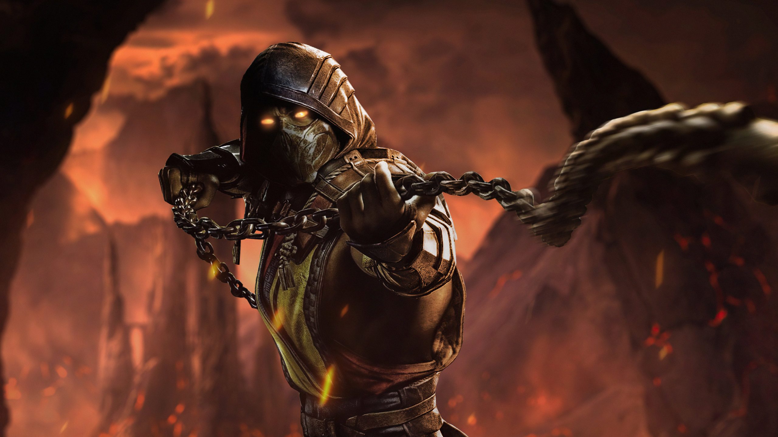
What a character.
Scorpion is a resurrected Ninja (or Samurai. Who can really tell even after reading the comics hundreds of times?) who can’t wait to avenge the death of his family and kill his opposite, the chill-blue Sub-Zero. He was once a human, but his rebirth as a wraith in Netherrealm left him nothing like his former self. Scorpion’s venomous eyes and cold-bloodedness show him as an antagonist and evil, but he is, in fact, neutral.
Yes, I said it. He’s neutral (one that can be translated into moral ambiguity).
The man went to hell and back. He has no intentions of ruling the world, creating armies or weapons of mass destruction. Yet, if that’s in the way of fulfilling his revenge lust, he wouldn’t mind making the necessary decisions. His conflict with the other characters is merely them standing in his way at times.
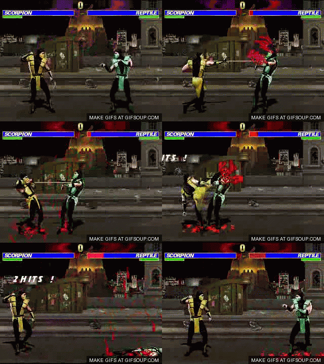
Scorpion isn’t really essential to the plot and his own (side) story. But there are so many layers to his personality and appeal to his appearance that he took over as the Mortal Kombat mascot. He was so crucial to the game that even when they didn’t want to include him in MKIII, he was still the face of the cover.
🔎Scorpion’s character design analysis
Honestly, Scorpion and Subzero have equally fantastic designs. One’s yellow, orange, ablaze, and hellish; the other is the opposite. But judging by how deep the creators went with Scorpion’s character and story, it was only fair he made the list.
His designs changed from game to game, but every appearance stayed true to what he was supposed to be. An unmasked Scorpion is a skull on fire; a masked Scorpion looks more human, but the white (sometimes orange) eyes, the leather jacket, the mask, and the gear obviously show he’s badass.
His spear and chain were taken after a scorpion’s attack with its poison gland. When he’s shown with a sword, it can be seen that the handles of his swords resemble the stingers of scorpions. while his shoulder pads and masks are also molded after the eight-legged crawlers.
What makes Scorpion so special?
The predatory arachnid went through hell and back but still cares about honor. His design is one of the best in gaming history, and as far as his personality goes, he captivated my attention in every single game or movie he’s appeared in.
Plus, he’s got one of the best finishers!
Honorable mentions
Pac-Man
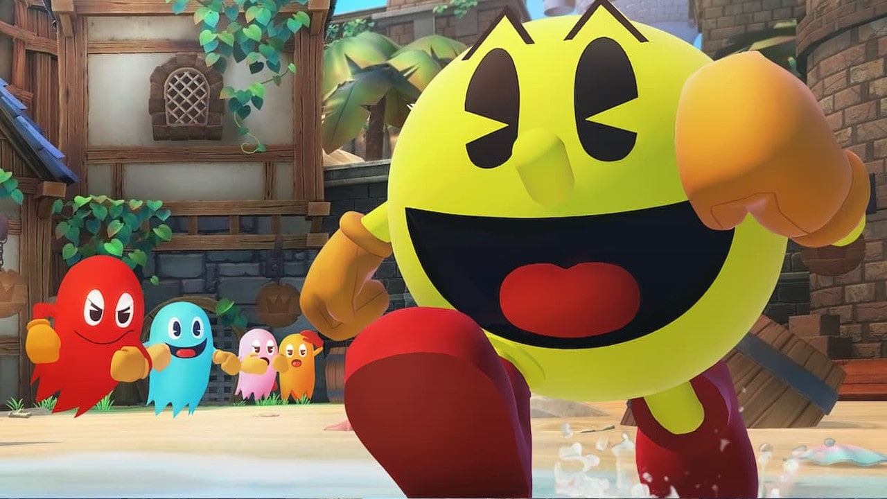
Namco’s idea to make this masterpiece which arrived in the U.S. in 1980, came from the animated series “Casper, the friendly ghost.” The loveable yellow circle, whose hunger for cookies never seems to end, is chased by four ghosts at all times. The game was more sophisticated than anything at that time and revolutionized the gaming industry, design, and culture.
If you think about it, Pac-Man is in constant agony because of these ghosts (sometimes referred to as monsters). I mean, all the guy wants is to eat his cookies, so leave him alone. Right?
Well, not really. Inky, Pinky, Blinky, and Clyde are living their after-life peacefully and won’t do anything before Pac-Man starts eating their cookies. Maybe Pac-Man isn’t the victim here. Perhaps he’s the one invading the privacy of the ghosts, and they just want to be left alone? Give it some thought.
However, if we consider Pac-Man the prey, the hunters become the hunted once Pac-Man devours a power pellet. This superpower was inspired by no other than Pop-eye’s spinach.
🔎Pac-Man’s character design analysis
To distance themselves from action video games at the time, the creators of Pac-Man came up with a yellow, circular character that had no implications of violence and is now considered one of the best video game characters of all time by many. The circle, as you might know, represents youth and the yellow color shows the fun side of a character who chews his way through instead of shooting laser beams and killing aliens.
More interestingly, Pac-Man’s design is reported to have been inspired by pizza! Yes, pizza with a missing slice!
What makes Pac-Man so special?
Pac-Man is a masterpiece because when I think about how much of an impact he has made despite its super minimalist design, it just leaves me speechless.
Luigi
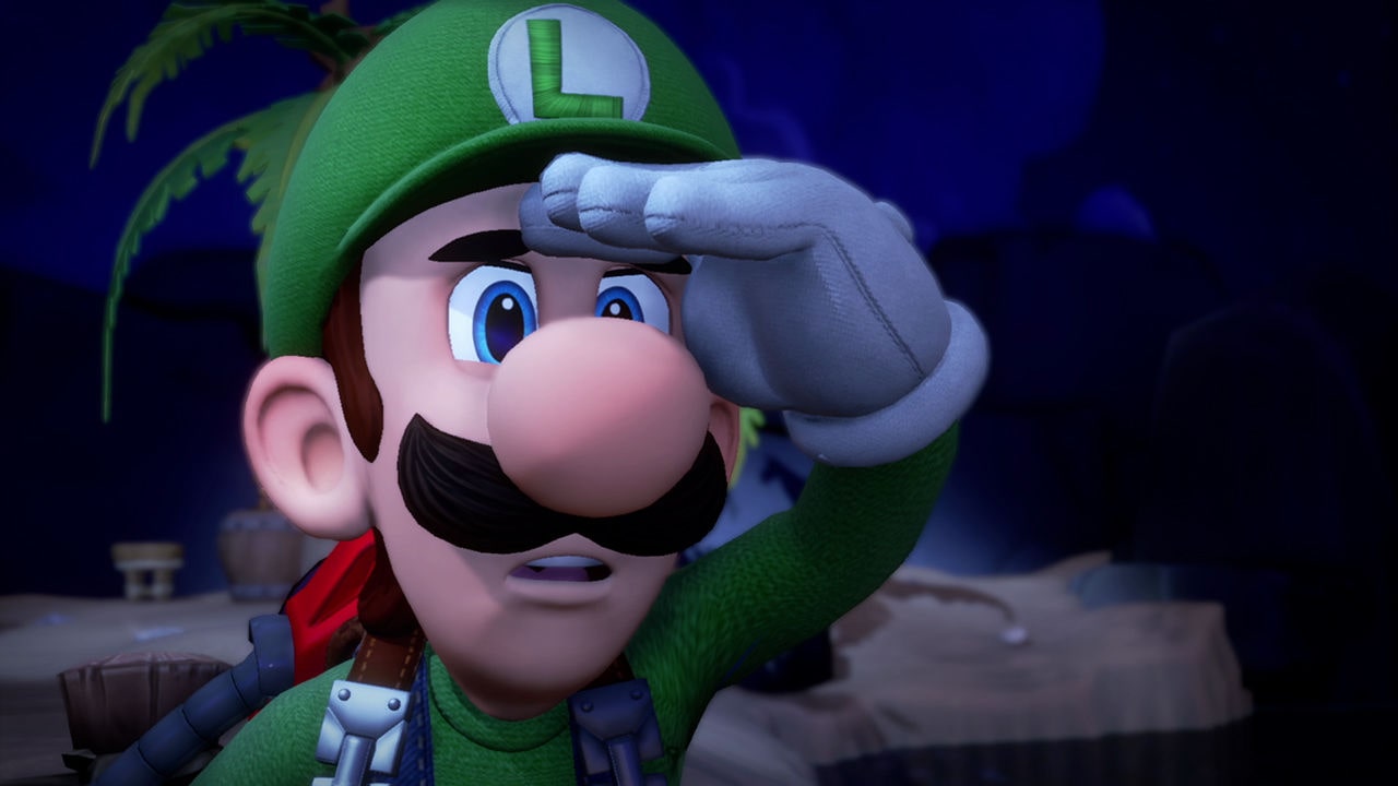
Luigi was introduced after Mario, giving him the role of a sidekick in the Mario Bros. series. He is kind, loyal, fun, and less charismatic than his brother. But I find his dependability and underdog personality appealing. Plus, he can jump much higher than Mario!
Many of us love sidekicks even more. Maybe because they display imperfections, something we can relate to.
The younger sibling is more conserved rather than impulsive. He gets anxious at times too. The creators occasionally openly displayed his “coward” personality to players. All that said, he always comes through whenever Mushroom Kingdom is in danger.
🔎Luigi’s character design analysis
While the circular shape implies dynamic energy and youth, We’ve got a rectangular character like Luigi, who’s more balanced than his brother. Another aspect worth pointing out is that Luigi is taller than Mario, and as seen with the Dalton Brothers, the taller ones are, well, less intelligent. As an advocate for underdogs, I don’t believe Luigi doesn’t match his brother’s intelligence. He’s just less showy and confident.
What makes Luigi so special?
Could Mario have completed his adventures without Luigi?
I rest my case.
So, friends, that’s a wrap for our ‘Top 10 Video Game Characters’ article. There were indeed many more characters to include, but I want to hear the rest from you. Who would you add or remove from the list? Why? Tell us in the comments!

Allen Rafiee
Allen is the Senior blog writer at Dream Farm Studios. In the five years he has been writing for startups and big companies, he challenged himself to learn all he could about digital marketing and finally became a key member of the Marcom team. When he's not doing all of that, you can find him teaching different languages, learning new recipes, and watching cool documentaries about, well, anything!

