So you want to choose the best character color palette?
Most articles and guides just give you some color palettes and tell you to use them at your own comfort! we, on the other hand, think you should how to choose the Best colors and then think of using color templates. So before you head over to Pinterest and get some inspiration to design your character, stay with us until the end and we promise some gold nuggets!
How color theory can make or break a character design?
Many marketing agencies rely on the power of animation to communicate a brand story. But imagine this:
what happens if you do not follow the universal principles of color theory in designing a character?
According to numerous marketing surveys, the right choice of color makes up 60 percent of a product or service’s success or failure. As a result, the right color in any animation will directly impact your clients’ revenue and lead generation.
As psychologists put it:
our subconscious mind is adept at making up meanings from different colors. If the colors evoke a sense of dislike, we won’t be happy looking at it.
Likewise, a character will look misplaced and inconceivable if you do not consider color theory psychology throughout the design process.
In this article, we will break down everything you need to know about choosing the perfect color palette for your characters. Then, We elaborate on some aspects of choosing a perfect color palette for character design. Finally, to put everything into practice, we have selected one of our most successful character designs to consider as a case study.
If you come from an animation background, It is important to know the basics. So head over to our in-depth guide on 2D animation production workflow before reading this article.
How do color schemes communicate brand incentives? (Color theory for designers)
Consider the words “Love” and “Like.” Which one do you think invokes more feeling and drama? If you were to use either of them in your advertising campaigns, which one do you choose?
The answer might sound too obvious but let’s take a more in-depth look.
Faber Birren, a famous color theorist, wrote in his book Color Theory about the link between color and decision-making in humans.
Just like the words “love” and “like” elicit different emotions, colors like red and black makes people feel certain things.
Now consider the same principle in character design: If your brand characters’ color doesn’t have the power to inspire action, it’s like you haven’t created them in the first place. Therefore, as a brand, you want to encourage a secure emotional connection with your customers and persuade them to buy or use your products.
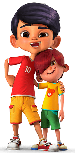
Now that you know more about the impact of color on human psychology, Let’s see how color palettes can make or break a character design.
Before you go to the next section, be sure to know what color psychology is. If you don’t, head to Design Wizard blog, where they have put together an excellent and informative article about understanding color theory basics.
How to choose character color schemes (4 proven and tested methods)
Let’s go step by step and see what process we should go through when choosing your characters’ color scheme.
Pick a robust color scheme as a foundation for your character.
Foundation colors, as the name suggests, are the building blocks of a good character. The first thing you should consider is choosing the colors within the same color gamut as your foundation colors. Some of the best foundation colors for 3D animation are:
- Natural tone colors: We call them earth colors because they are based on our environment’s natural elements. Basically, any color containing some brown – the color of ground or soil, green – the color of leaves and trees, blue, the color of the sky, and the red sun are considered Earth tone colors.
- Jewel tone colors: the rich and highly saturated hues colors from well-known gems like sapphire blue, ruby red, amethyst purple, citrine yellow, and emerald green are known to be jewel-tone colors.
- Pastel tones: They are regarded as Pastels because of their pale colors. They have high value and low saturation and are the opposite of jewel-tone colors because of their lower color density. This type of color is prevalent in 2D animation design.
- Warm or cool tones: Undertone colors are broken down into three categories; warm, cool, and neutral. Warm undertones tend to lean towards peachy, yellow, or golden tones; cool colors, on the other hand, signify hints of pink, red or blue; while neutral is a mixture of these colors.
Choosing each of these color tones as the foundation for your characters has different outcomes, though. It all depends on the value, story, and message your brand is trying to convey.
If you want to know more about how color psychology can impact animation, our psychology of character design article has shed some light on this topic.
Are you a visual learner and want to know more about how color theory impacts a character’s psychology? We’d suggest checking out Toptal’s great blog post; they have put together an infographic about color theory to grasp color psychology’s essential concepts.
4 Best tips on using color theory in character design
It’s not enough to create a character with vibrant and eye-catching colors; what’s more important is how you combine the different colors in a way that makes an ever-lasting impact on your clients. Here, we are going to give four tips on how to maximize the success of your marketing campaigns through the power of color theory:
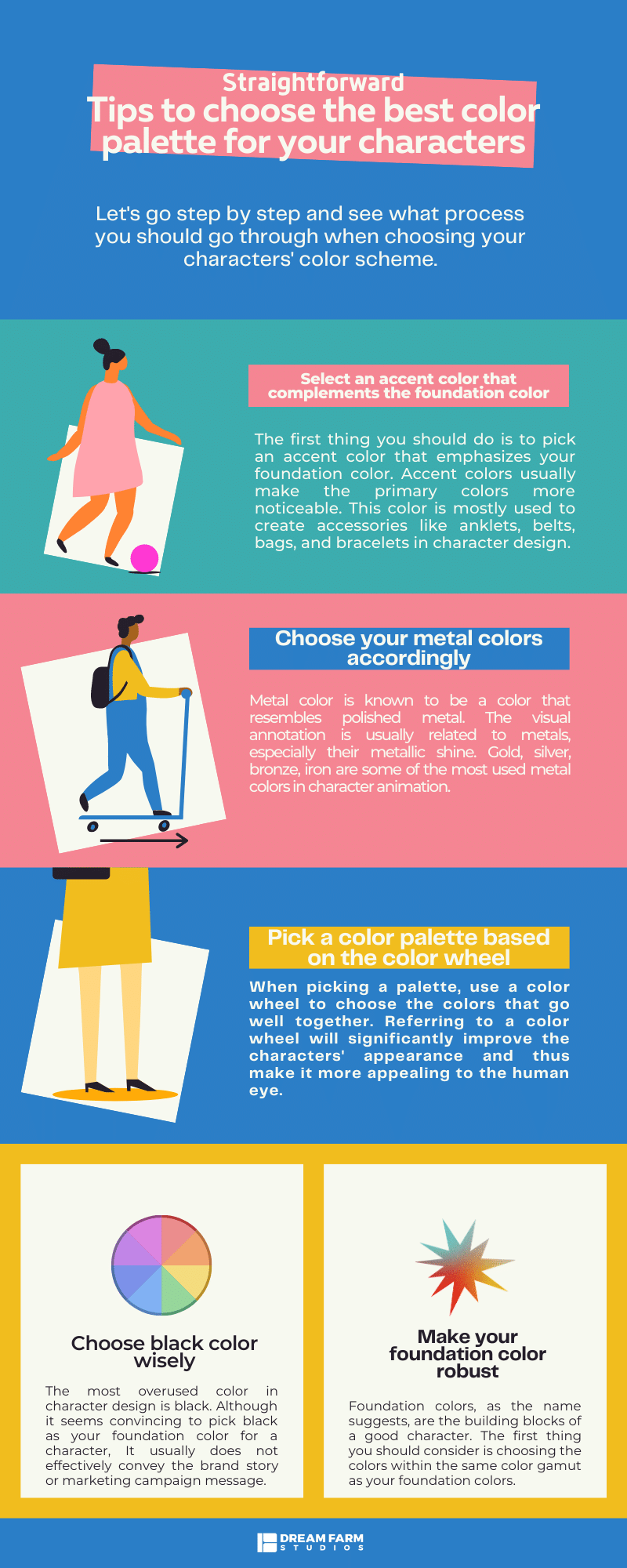
1. Select an accent color that complements the foundation color
The first thing you should do is to pick an accent color that emphasizes your foundation color. Accent colors usually make the primary colors more noticeable. This color is mostly used to create accessories like anklets, belts, bags, and bracelets in character design.
2. Choose your metal colors accordingly.
Metal color is known to be a color that resembles polished metal. The visual annotation is usually related to metals, especially their metallic shine.
Gold, silver, bronze, iron are some of the most used metal colors in character animation. You can also add cohesion to your character costume and then match your jewel-tone colors’ metal accents.
3. Pick a color palette based on the color wheel
If you look at blockbuster Hollywood movies, there’s usually a combination of teal and orange in the background that makes the movie’s atmosphere so American! That’s because teal blue is the opposite of orange on the color wheel, and the right warm oranges combined with teal add vibrancy to space.
When picking a palette, use a color wheel to choose the colors that go well together. Referring to a color wheel will significantly improve the characters’ appearance and thus make it more appealing to the human eye.
4. Choose black color wisely.
The most overused color in character design is black. Although it seems convincing to pick black as your foundation color for a character, It usually does not effectively convey the brand story or marketing campaign message.
Besides, it’s cliche and does nothing to make you stand out from animation commercials’ competitive market. It’s better to use black as an accent color or a color to link a few other colors together.
- Important note: If you want to use black as a primary color, consider using a dark tone palette that includes grays, dark blues, and deep reds instead. It will give you a much better definition and make a complete look.
Head over to our other blog post about character design shapes to see how shapes and color theory are combined.
The most common questions about character color palettes and how to use them in character design
We have accumulated the most common questions that an average reader might have when reading about this topic. If you have any other questions, don’t hesitate to drop us a comment.
How many colors should a character have?
When choosing a color scheme for a character, it’s common to get a little too excessive in using different colors in a cartoon storyboard. According to the Cleveland Institute of art, a character should have three primary colors, but you can go beyond this number only if you know why you pick more colors.
Try this to see if you have used too many colors:
Do you feel confused and dizzy when you look at your character?
If the answer is yes, It might be wise to lower the number of colors (Unless, of course, there’s a reason for complexity). As a rule of thumb, best animation studios usually try to limit the colors down to three or four to keep it simple and effective.
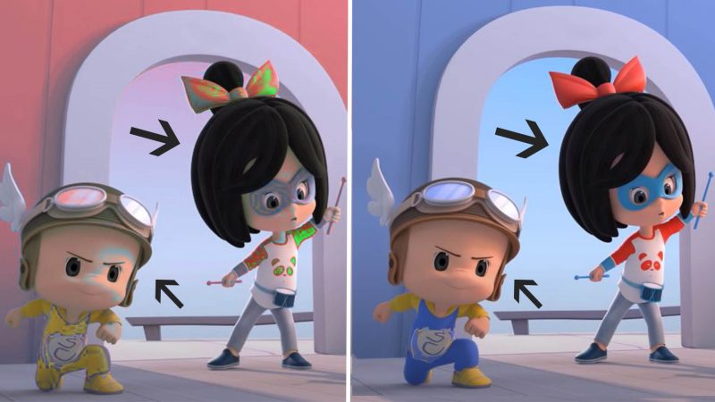
Let’s compare the following pictures:
The picture on the left uses a wide variety of colors, making the characters dull and boring. On the right side, though, the colors are much more balanced and used in harmony with the environment, making the characters much more appealing.
What are the best three color combinations in character animation?
To give you some ideas of a good and bad color combination, take a look at the following three-color combinations that have proved to be working:
- Turquoise, Dark Blue, Beige: Innovative and assertive like Blue Fairy and Snow White
- Yellow, Blue, Red: groovy and brilliant like Superman
- Beige, Brown, Dark Brown: friendly and alive more used in anime movies.
- Green, Blue, Yellow: juvenile and intelligent …
What traits do colors represent?
Colors have varied meaning across different cultures but the following representations are universal in the case of emotions:
- Red: Passion, Love, Anger.
- Orange: Energy, Happiness, Vitality.
- Yellow: Happiness, Hope, Deceit.
- Green: New Beginnings, Abundance, Nature.
- Blue: Calm, Responsible, Sadness.
- Purple: Creativity, Royalty, Wealth.
- Black: Mystery, Elegance, Evil.
- Gray: Moody, Conservative, Formality.
What are the 4 personality colors?
Blue, green, gold, and orange are among the personality colors that are used most often.
How do you choose a color scheme for a character?
Start by determining what kind of emotional and psychological weight you want to convey through your character, then use the colors that complement that emotion. Don’t forget to use the appropriate shapes to prevent creating contrasting characters.
Should we use Disney character colors?
In the character design industry, many designers and agencies go for Disney characters’ color palettes as role models for better recognition. Does this mean we should create our characters based on Disney only? Certainly not, What matters the most is that you take advantage of this color palette’s versatility and then add something unique to the color palette that makes it stand out.
Below is a list of the most well-known Disney characters along with their primary color palette:
- SNOW WHITE: strong and contrasting colors: red, yellow, and blue.
- CINDERELLA: soft and dusty colors: blue, pink, white
- ELSA: cold and monochromatic: shades of blue, green, and bright purple
- MULAN: vibrant colors: pink, blue, green
- BUZZ LIGHTYEAR: Pastel colors: green, purple, white
- CAPTAIN HOOK & MR. INCREDIBLE: contrasting dark colors: red, black, gold
We highly suggest you try to understand the reason behind every color you choose for your color palette. If you have any ideas or critiques regarding this, we are more than happy to hear your thoughts.
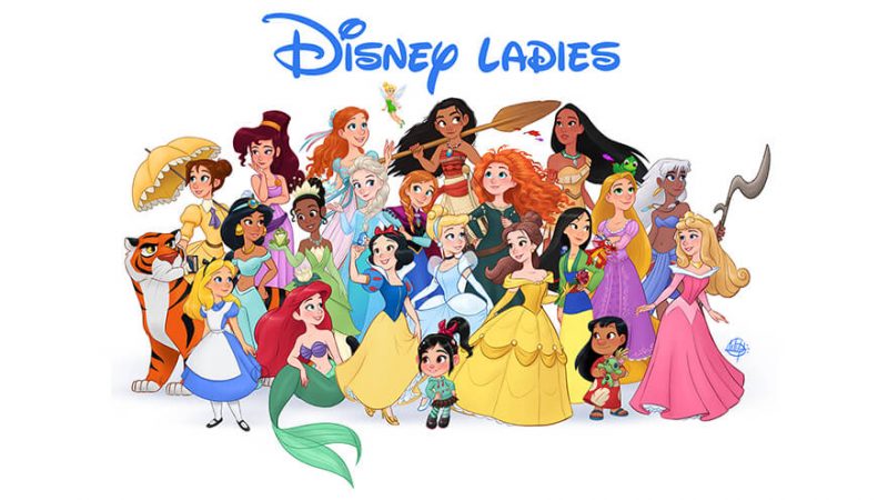
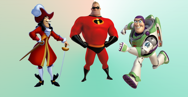
Don’t try to copy Disney color palette, Instead, steal the idea behind each character and try to come up with your own style!
How does Dream Farm implement character color theory? [case study]
If you take a look at our characters in the commercial animation section of our website, you’ll realize that our primary focus is to design well-colored characters that aspire to make a deep connection with the client.
This character has been designed based on the Razi Insurance brand mascot to convey the following traits:
. Agile
. Flexible
. Modern
. Reliable
. Potent

We tried hundreds of different color palettes to see which one conveys the personality type we have chosen for the brand character. Finally, we have come up with the following:
- White: White color triggers reliability, virtue, and health, which are regarded as the main characteristics of an insurance company.
- Dark Blue — Dark blue stands for professionalism, security, and formality, which act as the brand expertise
- Accent colors like dark brown and black show the agility and flexibility of the character.
Final Thoughts
Whether you’re a marketing agency that aspires to influence the clients or a brand that is thinking of designing an exclusive mascot, choosing a well-balanced color palette can play a huge role in conveying the most important messages. This article will help you make sense of an appropriate color palette for the characters and some of the best tips and tricks that can turn the brand image upside down.
Where to go from here?
Check out our portfolio in the character design studio and see how we implemented color theory best practices to achieve the best results possible.

Arash Naghdi
Arash is the equivalent of Buzz in Toy Story when he goes to infinity and beyond, but never comes back! responsible for our blog and content marketing efforts, he always delights the audience with his tenacity and passion in creating the extraordinary.

Such an informative article for an important subject in character design. Keep up the good job 😊
Thank you very much Nitin. glad you liked it!
Great to see this process great stuff, keep it up
I’m thrilled to hear that Abdelrahim, Thank you very much 🤗
This is a lovely piece and very informative. Thanks a lot.
Thanks Michael, It would be much appreciated if you shared this with some folks interested in character design
Thx for the informative article. Personally I don’t think choosing Disney color palette will do any good to the character design as it ruins the genuine sense of the character personality
Yes i do agree with you Mari. However I would say going for Disney color palette can help your characters to get more recognition since they are familiar to the viewers eye.
it was really helpful appreciate it thx alot
Thank you very much Akash. Thrilled to hear that !
We know for a fact that color plays an important role in character design but what’s even more important is that the use of color complements brand incentives. Thank you very much for shining some light on this important and usually underestimated topic.
Hi there Mia, thank you very much for the kinds words and taking the time to read through our article. We’re all about shedding light on underrated topics in character design and animation 😉
Great content for character design color principles. You can also check out Pinterest to get some idea about the implementation of these principles
We could really use your advice Minuq, Pinterest is a great place for inspiration.
bruh
i like it 😀
It was really Helpful to help us, we appreciate 😀
You’re welcome Makiyah, glad to hear that.
great article as always, keep up the good job Dream Farm Studios.
I think color theory has such great impact on a character design that it’s more important than anything else. I always remember the characters from animation from the colors of their body and clothes.
Reading first time this kind of amazing information about the color for character. And digital coloring thank you.
Hi there Parveen, glad you liked our article.
For stable color tones, monochromatic is the best to select.
That’s a great point RituSharma. Monochromatic colors are a fantastic choice for stable colors since they are derived from a single hue.
Knowledge of color scheme and meaning of important colors can help in deciding the right color for the design.
That’s quite right Ritusharma.
Knowledge of color schemes plays a big role in deciding the right colors in design.
Color theory is about what colors mix well and look good together not what meaning people give them.
That’s a great point, thx for that.
Thanks for this blog. It helped me a lot